New images reveal global pollution trends
23 August 2024
The global concentrations of one of the main air pollutants known to affect human health have been graphically illustrated in a new way by a team of scientists.
Created by the universities of Leeds, Edinburgh, and North Carolina State, and the UK Met Office, the Air Quality Stripes starkly contrast the significant improvements in air quality across much of Europe with the alarming deterioration in parts of Africa and Central Asia.
The findings of the Air Quality Stripes project highlight both the successes and ongoing challenges in tackling air pollution worldwide.
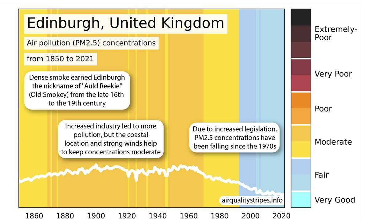
EPCC data scientist Malcolm Illingworth worked with air quality researchers to help combined model predictions of particulate matter (PM2.5) with satellite data to create a new time series of data spanning 1850 to 2021. Inspired by the University of Reading Climate Warming Stripes image, the researchers then created their own illustration to plot the changing trends in outdoor concentrations of what is known as particulate matter air pollution, a mix of tiny liquid or solid particles such as dust, dirt, soot, or smoke, which are found throughout the atmosphere.
Dr Steven Turnock UK Met Office senior scientist who provided the data for the Air Quality Stripes project.“Presenting this scientific data as Air Quality Stripes really brings into focus the stark contrast in air quality trends and people’s exposure to poor air quality depending on where they live.”
There are stripes for the capital city of most nations worldwide with two additional cities for China, India, and the United States. The research team also included their own cities of Leeds, Edinburgh, and Exeter.
The lightest blue stripes meet the World Health Organisation Air Quality Guidelines which were introduced in 2021, with all other colours exceeding the guideline values.
Data from computer simulations and satellite observations were combined to estimate the changing concentrations of particulate matter since the beginning of the industrial revolution, with the colour palette for the stripes devised by an artist who analysed over 200 online images of “air pollution” to identify the dominant colour palettes.
Key findings
- Europe's air quality gains.
The images show substantial reductions in particulate matter levels across most of Europe (predominantly Western Europe). Stricter air quality regulations and technological advancements have successfully reduced particulate matter concentrations in most European cities (eg London, Brussels, Berlin). - Worsening conditions in Central Asia and parts of Africa.
The visualisations reveal a concerning rise in particulate matter pollution in many cities in central Asia and Africa (eg Islamabad, Delhi, Nairobi). Rapid urbanisation, industrial growth, and limited regulatory frameworks are contributing to this troubling trend, which poses significant health risks to local populations. - Global disparities.
The images highlight the stark disparities in air quality progress between different regions, emphasising the need for targeted international efforts to address the growing air pollution crisis in the most affected areas. - The influence of natural sources.
This was particularly notable in some locations. These sources include desert dust and wildfires, while proximity to the coast was often quite noticeable with locations such as Jakarta having lower levels than might be expected.
EPCC researcher Dr Kirsty Pringle, the project's co-director, said: "Air pollution is often called the ‘invisible killer’, but these images make the invisible visible, showing the changes in particulate matter pollution over the decades.”
Dr Jim McQuaid, an Associate Professor of Atmospheric Composition in the Leeds’ School of Earth and Environment, who is co-lead on the Air Quality Stripes project with Dr Pringle, said: “The bottom line is that air pollution is one of the world's leading risk factors for death, it is thought to contribute to one in ten deaths globally. Our Air Quality Stripes show the huge range in trends and concentrations around the world. The stripes demonstrate that there is still more work to be done to reduce people’s exposure to poor air quality, and in some places a great deal more!”
A cocktail of pollutants
Particulate matter, or PM2.5, has a diameter less than a 30th of the width of a human hair and can easily penetrate deep into our lungs. The smallest particles cross into the bloodstream and affect our health, and some have even been detected in the blood of unborn children.
They can come from natural sources such as volcanoes and deserts but are also produced by human activities such as industry, cars, agriculture, domestic burning, and fires arising from climate change.
PM2.5 has been linked to a very wide range of health issues ranging from breathing problems like asthma, to reduced lung health, increased likelihood of developing cancer and heart disease, and an increased risk of developing many diseases including diabetes, Alzheimer’s, and Parkinson’s.
The World Health Organisation recommends the annual average concentration of PM2.5 should not exceed a concentration of 5 micrograms per cubic metre air (5 ug/m³). This new guideline is a concentration which is generally classed as very good air quality. It is important to remember that there is NO safe level of PM2.5 recognised by medical science. At present, 99% of the world’s population live with concentrations above this value, with the highest PM2.5 levels typically found in low- and middle-income countries.
The AQ stripes use an annual average to take account of the ups and downs due to changes in weather patterns throughout the year, and to make comparison between locations simpler. However the researchers point out that even short-term exposure to very high levels can quickly have acute health effects requiring medical treatment.
Dr McQuaid added: “We created these to try to illustrate the complex data that computer models generate, into something that is much easier to understand. I wanted it to be simple enough that non-experts could look at it and be able to understand it without having done science since leaving school. “
Dr Pringle added: "The images show that it is possible to reduce air pollution; the air in many cities in Europe is much cleaner now than it was 100 years ago, and this is improving our health. We really hope similar improvements can be achieved across the globe."
Further information
To find out more, please visit airqualitystripes.info
The initiative is a collaboration between leading environmental research institutions, EPCC, and The Centre for Environmental Modelling And Computation (CEMAC). Led by the universities of Leeds and Edinburgh, the project aims to provide valuable insights into air quality trends and support efforts to mitigate air pollution worldwide. Data for the Air Quality Stripes project was provided by the UK Met Office. The Software Sustainability Institute provided specialist graphic design to help create images of high quality that are clear to a broad audience.
The Air Quality Stripes follow in the footsteps of the Climate Warming Stripes which were created by Professor Ed Hawkins at the National Centre for Atmospheric Science and University of Reading in 2018 and have since become very widely used as a visual representation of the Earth’s warming climate. Professor Hawkin’s work has since inspired the creation of the Biodiversity Stripes which show biodiversity loss, and Ocean Acidification Stripes.
The University of Leeds and the University of Edinburgh are both members of the Met Office Academic Partnership (MOAP).