How to make an impactful scientific visualisation
18 July 2024
Visualisation is a core component of most HPC workflows. Any field working with 3D data, from computational fluid dynamics (CFD) to molecular dynamics or structural mechanics, will require researchers to analyse the large amount of data produced and communicate their findings and results to others.
In most cases, researchers use tools designed and developed for them, like ParaView, tecplot or VisIt. Besides the visualisation capabilities themselves, they allow users to postprocess the data and read a large range of file formats usually encountered in research.
At the other end of the spectrum, tools like Blender, Houdini, or Maya are heavily used in 3D animations and CGI/VFX industries where producing engaging, visually appealing or impactful imagery is the main goal. This different target audience and purpose dictates design choices as well as features. Taking the example of Blender, an open-source libre 3D package, it is capable of 3D modelling, animating objects, accurate colour grading, render ray traced images, texturing, video editing and much more. All of these features allow for very fine control over every element of the visualisation, producing either photorealistic or stylised images as can be seen on the images linked here, both rendered by Blender.

This post explains how tools like Blender can be used for scientific visualisation. A selection of tools developed at EPCC to facilitate this are highlighted to demonstrate the potential benefits for scientific visualisation.
Why is it needed?
Prior to any visualisation design, scientists need to ask themselves several questions:
- Who is the visualisation targeted at (eg peer researchers, funding bodies, or children in an outreach context)?
- What is the medium (a paper, presentation slide, image online for a blog post or a video displayed at a conference booth)?
- What is the message or goal of the visualisation (explain a phenomenon, show a feature of the code used etc)?
All of these answers dictate the type of visualisation needed, from its look to the level of details or the vocabulary used in captions. Here are, as an example, two visualisations generated from the same CFD simulation of a pilot jet flame. The simulation was run by Chris Goddard (Rolls-Royce) as part of the ASiMoV project (EP/S005072/1).
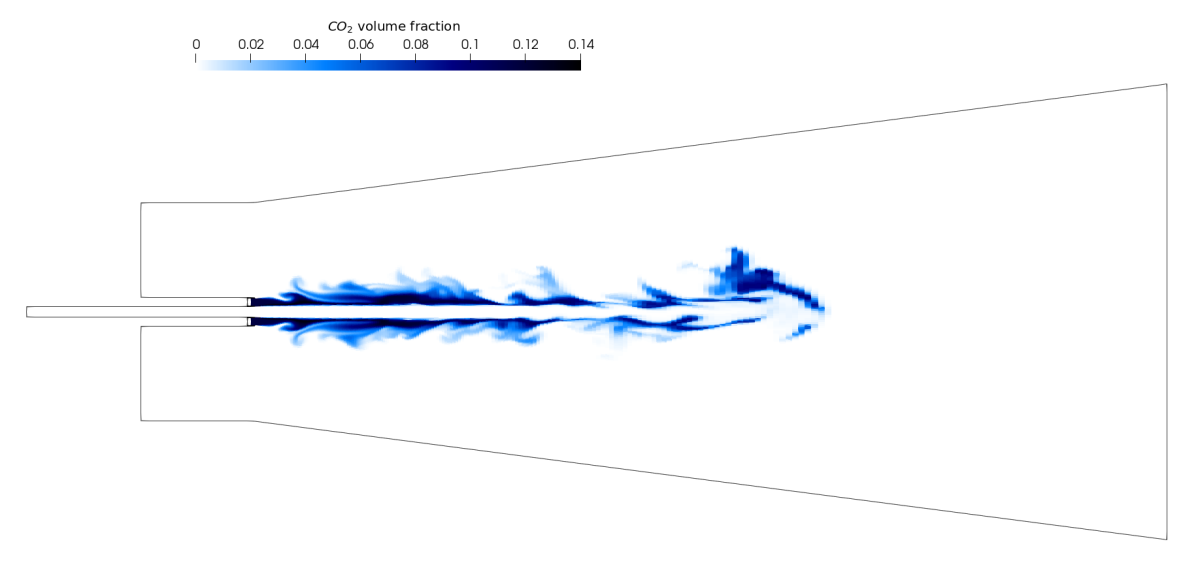
Above, upper image: slice of the domain showing CO2 volume fraction generated by Paraview. Above, lower image: photorealistic video of the pilot jet flame rendered by Blender.
The first images could appear in a paper targeting other CFD researchers showing the volume fraction of CO2 in the domain on a slice. Such visualisation is less suited for a wider audience. The second one however, generated with Blender, is a lot more visually engaging and could be used for outreach purposes or social media. The realistic render of the flame makes it more approachable by a wider audience without prior knowledge of the physics or the phenomenon itself. Tools like Blender are particularly well-suited when the target audience is less technical or at least when the purpose is less analytical. Though use cases of technical and analytical work being visualised using Blender exist, as shown in Klapwick et al. 2021, the comparison of experimental results with simulation ones can be helped by using photorealistic visualisations.
Overall, the greater versatility with the addition of ray tracing rendering makes it an ideal tool when some photorealism is sought.
How to use Blender for scientific visualisation?
Because Blender is primarily aimed at 3D artists, the workflow when working with scientific data is a bit involved. This is the reason why EPCC has developed tools and designed a workflow for helping with the ingestion of simulation results and ease the work in an HPC context (available at https://github.com/EPCCed/blender4science).
The overall workflow is as follows:
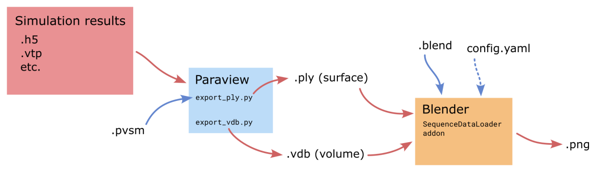
Data post-processing
First, to convert raw simulation results to a format readable by Blender and allow researchers to perform some postprocessing steps, ParaView is still used. Two scripts were developed to help export sequences of files for animations, and because each timestep is independent, both of the scripts were designed to be run multiple times simultaneously and go through each timestep in parallel. The following code can for example be used to run 20 instances on a single compute node.
module load paraview
for i in $(seq 1 20)
do
   pvpython export_vdb.py --data-path solution_data --cell-size 0.0009 --export-path volume_export &
done
wait
The result of this step is a folder containing either a single .vdb file per timestep storing volume data, or .ply file per timestep storing surface data (if export_ply.py is used instead).
Ingestion in Blender
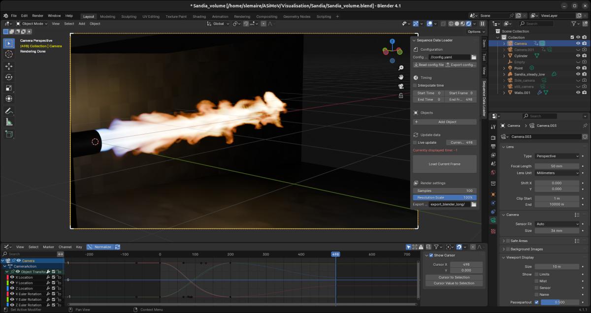
Blender can directly load sequences of .vdb files, assigning each file to a different frame and handling the animation. However it doesn’t allow the same for .ply surface files, which is partially why the SequenceDataLoader Blender add-on was written. With it sequences of surfaces can be read and stepped through interactively. Here is a screenshot of Blender with the add-on open on the right. The Objects list is empty because this scene does not use surface sequences.
Designing the scene
This step is where most of the work happens: the researcher has to decide what kind of material each element of the scene will be made of, what kind of lighting will be used, where the camera will be located and how will it move and so on, which requires some knowledge of how Blender works. However, even if the interface can look daunting, most use cases will only use a fraction of the tools available, so an extensive understanding of it isn’t required.
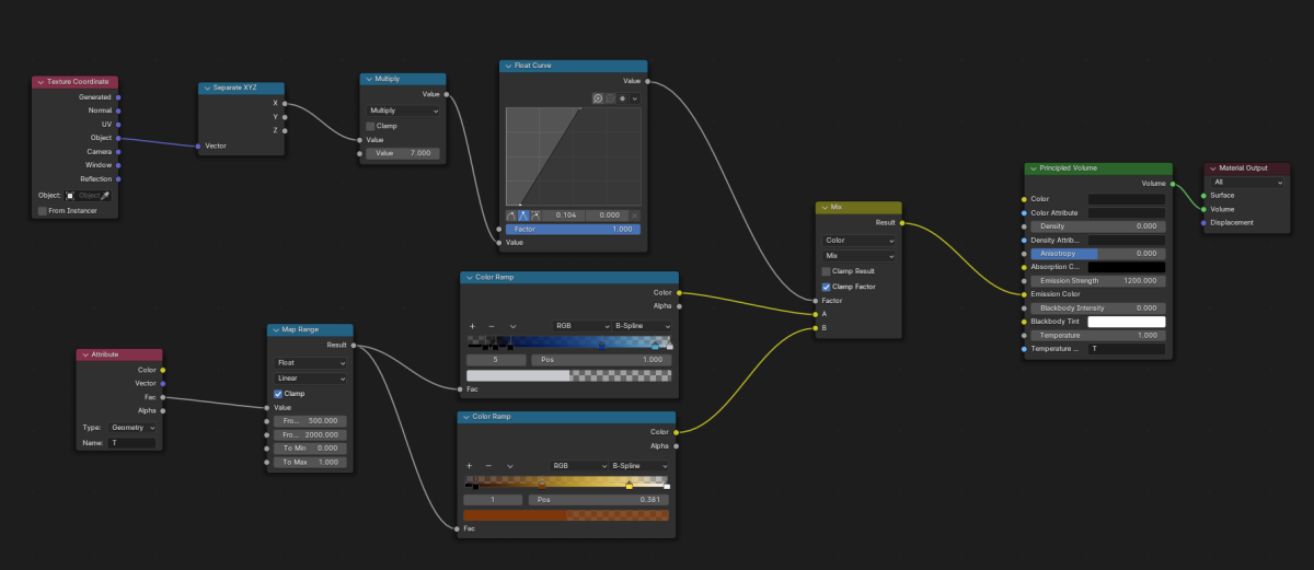
For example, you can see below the material used for the flame in the video shown above.
Rendering on an HPC/headless system
As well as loading file sequences, the SequenceDataLoader add-on also brings several usability features when working on an HPC/headless systems. Examples of these include the optional use of YAML config file to set up the render and edit key parameters without the GUI or the handling of the render of multiple frames simultaneously.
As for the Paraview export, each frame of the final animation is independent, hence they can be rendered simultaneously on multiple nodes of an HPC system. In practice, multiple single node jobs with the following line can be run:
blender -b scene.blend -E CYCLES --python-expr "import bpy; bpy.context.scene.sequence_data_render.render_frames()" -- --config-file config.yaml --frames 1-500The add-on ensures that all the frames between 1 and 500 are rendered only once regardless of the number of Blender instances being run simultaneously.
As a point of reference, the 500 frames of the pilot flame video used 25 CUs (=3200 CPUh) on ARCHER2.
Additional resources
For anyone wanting to get started with using Blender for scientific visualisations, the following resources are highly recommended:
- Surf provides an extensive freely available online webinar about the usage of Blender for scientific visualisations:
https://surf-visualization.github.io/blender-course/ - The NCSA Advanced Visualization Lab has a video series about data visualisation for science communication. It isn’t as technical and won’t go through any tool in particular but it details what makes a visualisation engaging:
https://www.youtube.com/watch?v=BPliuU0FFo4&list=PLNeMI_xZZDKNBoYHYZ56K… - A webinar given by EPCC on the use of Blender for scientific visualisations:
https://www.archer2.ac.uk/training/courses/240214-visualisation-vt/